WSU Logo voted best of College football
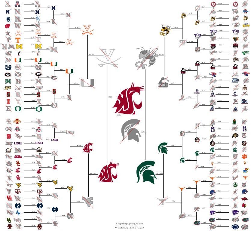
With WSU football national championship dry, they can say they have the best logo in college football. This party school has another thing to celebrate. An unofficial bracket pull was put on by Reddit’s college football subreddit that had over 160,000 subscribers. It featured all D1 football colleges, and faced off each logo. The fans voted on each match up to eventually crown the best college football logo.
The Cougs faced off with San Diego State in the first round and won the majority vote of 72.2%. In the second round they faced off with Pac-12 rival USC. They still moved on with 62.5% of the vote. In the round of 32 they escaped CAL with 52.5% of the vote. Moving to the sweet 16 they passed LSU with 69.1% of the vote. Now in the elite 8 they managed to get 68.8% of the vote. With two rounds left they only had Virginia to beat. 72.6% of the vote did the job as they were now in the finals. Only one round is left and the Cougs squeeze by Michigan State to become the best logo in College football.
Washington State’s logo goes all the way back to the 1930’s when a man named Randall Johnson, who was an art major and graduated at WSU created the first model of their one of a kind logo. It originally had the letters WSC but shortly after was changed to WSU when the college became a university.
Wazzu fans and grads can celebrate their accomplishment of having the best college football logo in the country. They now have another reason to tell Udub fans that they have the upper hand. UW didn’t make it past the first round.

As a senior and editor of The Gig Harbor Sound, Jordan takes pride in representing his school, while making sure that all voices are heard at Gig Harbor...


